Wednesday, February 29, 2012

FTTC158 Country Comfort

I always love checking over at the Timeless Tuesday challenge over at Flourishes. Tammy was hosting a great challenge this week to make it the theme of "country comfort". I love these peas from Flourishes and nothing seems to say country more to me that homegrown veggies! I added some gingham paper and some jute and a button.

Monday, February 27, 2012

Faith based blog challenge

I cannot believe how fast February has zoomed by, but it has. So, it's time for the challenge that my faith based blog group I belong to hosts at the end of the month. Jackie asked us to have a love theme, not using the usually February colors of red and pink. She also wanted things of nature on it and at least one circle. I used this design paper from Basic Grey in selecting my colors. I used the butterflies from Our Daily Bread Designs and a sentiment from Flourishes. I used two circles and added this big purple bow. The sentiment is God's greatest commandment to us, "To love one another," so that is a theme we should carry in our hearts on a daily basis. You can check out the other cards from our group by clicking on the blogsites on my sidebar that lists all the members.

MOJO MOnday 230

No better way to get that Mojo going for the week than to do the Mojo Monday challenge.  I used by favorite color combo on this one, got out one of my first Verve sets that started my collection, and put the card together. The punches used for the card are all from Martha Stewart.  The zebra print dp added a unique touch to its overall look.

Sunday, February 26, 2012

SS12


This is for the Sisterhood Sunday challenge which was a sketch challenge this week. This is another wonderful stamp I purchased from Rubbernecker years ago, but it never seems to lose its cuteness. It is a full basket of chicks, but I cut it in half so it would fit my space for this card. The design papers are from Basic Grey, the card base is pear pizzaz by Stampin' Up. The flower punch is from Martha Stewart.

Saturday, February 25, 2012

ODBDSLC98


Layering up some of my spellbinder shapes I made this card. The top layer is the one that lifts up for the inside of the card. I used this wonderful ODBD background stamp and cross stamp as my image and texture. Adding the jewels was the final touch. This is for the Our Daily Bread Design Shining the Light Challenge.#98.          

Word Art Wednesday


After reading the loving comments left on some of my cards on my blog this week, I discovered one from Karen Letchworth with a personal invitation to join this fabulous challenge called Word Art Wednesday. This is a new challenge I with which I was not so familiar and their challenges make use of scriptures and inspirational messages on the entries. On the blog you even are allowed to copy a scripture to use on your challenge. So, thanks Karen for this invitation. These are exactly the kinds of cards I make most and will love seeing all the others that are submitted on the blog. I'll have to check it out each week from now on. This lily is from Flourishes and the design paper is from Basic Grey.

Friday, February 24, 2012

Punny card

What a fun challenge for a Friday!! Since the challenge over at CAS-ual Friday's Challenge is being sponsored by Skipping Stones Designs, I just had to use one of their cute sets for my card.

Monday, February 20, 2012

MOJO229

A great sketch this week for the MOJO 229 challenge. I just love this little flower stamp from verve. I used it for paper piecing on this card. I embossed the green panel and had these left over diecuts from a different project. I added pearls to the centers. I can't ever seem to have enough of these types of card. It seems so many need prayers lately, looking for jobs, overcoming illnesses, losing loved ones, or families splitting up. I find it comforting to know God is with us.

Sunday, February 19, 2012

Sisterhood Sunday Challenge 11

This is the first stamp I ever ordered from Rubbernecker stamps. It has always been one of my favorites. Loved using greens on this. I went through my whole array of green copic markers to find just the right look for this card. I was so excited last week to find that I had won a stamp. Gotta go do some shopping to find another great Rubbernecker stamp. They have such a great design team over there and I love that they have added all these fun events during the stamping week. Keep it up, gals, right now you are a hidden pearl in the land of   challenges, but I love what you are doing. Here is where you will find this awesome challenge. After checking out the Stampin' sisters in Christ challenge 127, this card fits those requirements as well. I'm not real big on combining challenges because I always love every opportunity to make a new card. But today I thought combining these two sister groups was a good idea!

{HSCRC12}Hymn4

This is my addition to my Hymn album I am making by following the HSCRC12 challenges. Patter gave us the fourth hymn title last week, "Standing on the Promises." I once heard a talk on Servant hood and the speaker gave this zinger in her talk: "Sitting on the premises is not the same as standing on the promises." God stands firm on His promises to us, and gives us all kinds of grace and mercy along the way. Yet we too often think just attending church is "good enough" to show our faithfulness.
I read in Psalm 145:13- "The Lord is faithful to all His promises and loving toward all He has made."
Don't we need to be a little more dilegent in what actions will reflect our faithfulness to Him?
Just wondering.......

Saturday, February 18, 2012

ODBDSLC97

I made 36 of these for a men's retreat coming up. I plan to put magnets on the back. I used baja breeze ink, rich cocoa, and tangerine ink dabbing them onto the scene. It took me less than 90 minutes to make them all. The crosses I found at Michael's in packages of 12. I thought this might qualify for the challenge. The verse is stamped in tuxedo black. Of course, the stamps are from Our Daily Bread Designs.

Thursday, February 16, 2012

HSCRC12 Hymn #3

Finally playing a little catch up on my hymns collection I have going for the HSCRC 12 Challenge. This is for the hymn "How Great Thou Art."  I used plum and razzleberry colors on this and I used a piece of the sheet music and some Layers of Colors images. I added a rhinestone flourishes. This is a wonderful hymn that I love.

Wednesday, February 15, 2012

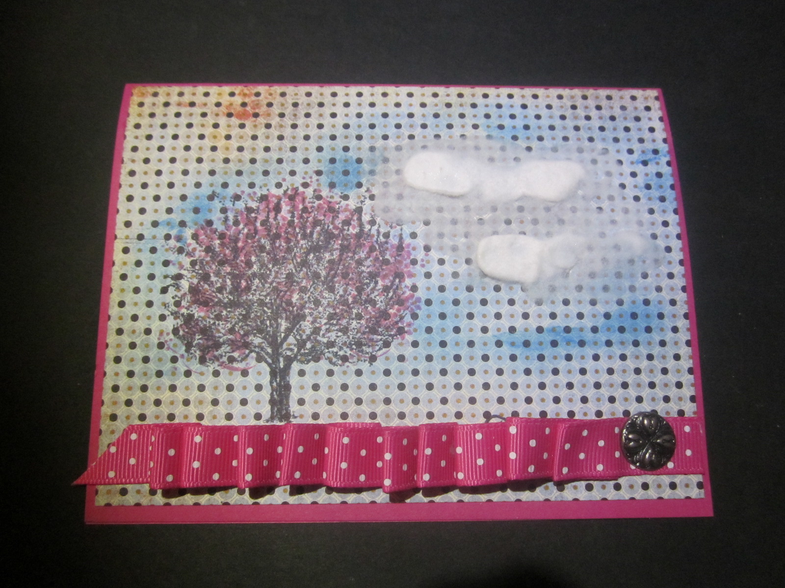
Sketch Challenge 372


I'm certainly ready for spring and fortunately we have had a wet winter, so hopefully spring blossoms will soon be bursting forth. I decided to get in the mood for spring by doing these cherry blossoms for the sketch challenge today at Splitcoast Stampers. The design paper is from Basic Grey, and the beautiful image is by artist, Marcella Hawley, who designs for Flourishes. She is my absolute favorite artist of floral images. She is just amazing. I have so many of her flowers in my stamp collection and gotten back to using them for my cards. When you have wonderful, beautiful papers, and masterfully done artwork in the images, it's not too difficult to make an awesome card. Look for the great ones out there. They are well worth their money and they are classical and timeless.

Tuesday, February 14, 2012

FTTC156

It is always fun to check out what the challenge is over at Flourishes Timeless Tuesday challenge. Today, Beate asked us to use red since it is Valentine's Day. I love this tulip by Flourishes and loved seeing all the red tulips I saw today in the store ready to be purchased as someone's Valentine gift.
I used my Cuttlebug embossing folder on ivory cardstock, diecut the frame with a Spellbinder using black cardstock, and added an ivory image panel, stamped in tuxedo black ink. I colored the tulip with my copics. I added some red seam binding for my embellishment.

Sunday, February 12, 2012

ODBDSLC96


The challenge for the Our Daily Bread Designs Shining the Light challenge this week was to use the letters from the word HEART and use things on the card that start with 3 of the letters. I used all 5, just to make me think a little harder. My heart thing is a heart; the e is for embossing; the a is for aqua; the r is for red, rhinestone, ribbon; amd the T is for torn paper. The stamp is from Our Daily Bread Designs.

ss10

This is for the inspiration challenge over at Stampin' Sisterhood. I've had these little heart stickers for a while in my stash, so this gave me the perfect opportunity to use up some stash. The diecut is my new one I just ordered from PTI. The stamp is a Stampabilities. The design paper is Basic Grey. It is on a white cardstock base.

Tuesday, February 7, 2012

MOJO227

Nothing like getting your MOJO going a day late, but things seem to click this morning for me. Found most of these design papers in my scrap pile and decided to work them together for this sketch. The stamps are all from Verve. I stamped in tuxedo black and colored the flower with copics. You can find this sketch over on the Mojo Monday blog here.

Monday, February 6, 2012

SSIC125

I thought this verse speaks so powerfully of God's love, the most powerful love there is. The stamp is from Layers of Color. I used a Spellbinder label, diecut it twice and put them crossing each other to make the green behind the scripture. Then I added some punched flowers, pearls, and gemstones. The dp in the background is a Basic Grey dp.

Sunday, February 5, 2012

SS9

This is for the Stampin' Sisterhood challenge #9. It was an inspirational challenge using this picture:

Masculine Valentine

I just love doing all those frilly, lacy Valentines with flowers and gems, but I have to admit making a masculine one is a real challenge for me. But I needed a few so here is what I came up with for the Basic Grey Challenge #61. I used  Basic Grey papers from my Oxford pad, which is full of fabulous papers so fitting for some classic men cards. I loved this diagonal plaid and always think those large grommets have a manly look too. I used 3 papers from that BG pad. I diecut the hearts with my spellbinder hearts, and made the zigzag border with a Martha Stewart punch. I tried using black ink first on the hearts, but it is not so easily seen, so I added the white inked "I love you!"

Saturday, February 4, 2012

JUGS122


Nothing better than getting to do a little stamping at the end of a busy day. After a busy, rainy day, I got to sit at the computer and check out the challenges for today over on The Daily Dare. Everyday I go to Splitcoasters stampers and The Daily Dare. Challenges are a real source of motivation for me, and it helps me narrow down the wide range my imagination can go on its own. For this card, the sketch was already figured out for me by the Just Us Girls challenge sketch today. Then I selected some Basic Grey papers, that helped me get together the colors, and many times the papers also help in the selection of the stamps I will use. I love florals, so I reached for this great little stamp that it is part of the Cherry Blossoms set from Flourishes. So how do you get your MOJO going for you???

OBDBSLC95

Our Daily Bread Design's Shining the Light challenge this week is to case someone whose work we secretly admire.   I just love the work that Dawn Lusk does for Our Daily Bread Designs. I found this lovely card on her blog using one of the new stamps I recently purchased from ODBD. Many of her cards have inspired me to actually purchase the stamps she used. I took my photo in front of my computer screen with her lovely card in the background on the screen. I used dotted paper instead of  stripes, I diecut red paper for my diecut butterfly, and I had a different Spellbinder label. I added a seam binding bow and a heart button. Thanks, Dawn for being the enabler you are, and girl, I just love your stamping skills and you are a master at coloring. Here's my photo along side of hers:


Friday, February 3, 2012

CAS-ual Friday 38


What a fun challenge this was! I had to do a little research and came up with the movie, The Piano,
winner of 3 Academy Awards in 1993. I remember at the end of the movie the piano sunk into the ocean. (Or I think that is what I remember.) So, the waves  represented that part I remember.  It was sad.
http://cas-ualfridays.blogspot.com/

VLVFEB2012

I don't make long cards very often, but maybe I should. This sketch was a fun one and I loved these Basic Grey pieces of design paper from the hopscotch paper pad. I love the colors used in these design papers and used them for my background and flowers. The verse and flower stamp is from Verve, of course. I don't do a Verve challenge without using one of their stamps. That way I use them at least once a week. I love them. The leaves are a Martha Stewart punch.

FLLCFEB12

The challenge was to use black and white and a pop of one color. I love this soft sky color that I put together with some black and white design papers. This is probably the first set I ever bought from Flourishes and it continues to be an old favorite of mine. This coffee cup is so easy to paper piece and it is like making design dishes. I used newsprint to diecut my flower and used this brad for the center.
TGIF and I have the day off, and here's hoping your weekend is a delight. I have a friend who spends many Saturday mornings going out for breakfast with her husband, just the two of them. He is her best friend, so this sentiment reminded me of them and this special time they carve out for each other in their busy weeks.

Wednesday, February 1, 2012

Belli Challenge 136

The Belli Challenge is to use hearts. I punched my hearts using this Martha Stewart punch, and then I stamped some pretty in pink hearts from an old retired set from Stampin' UP. I embossed the white paper before punching with a Cuttlebug embossing folder.  I added the wide pink ribbon and pearls.

CTD177

I loved the colors selected for the Color Throw Down Challenge this week - black, mambo melon, and white. I used a Sizzix embossing folder for the background white panel, stamped the daisies with tuxedo black and colored the image with my copic markers. I drew black lines behind the flowers and added a mambo melon frame. I added the ribbon as a final touch.